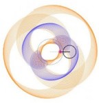
When I first started getting interested in roulettes I began in polar form graphing limaçons. Without going into as much detail as with the roulettes, I offer just one today.
I found this Winplot illustration instructive as to how polar graphs are formed and just how the graphs work and relate to rectangular form graphs of the same functions. So this could be used as a first example, or an investigation of its own.
For my example we will consider the limaçon, or a cardioid with an inner loop, given below (using t for the usual theta, since the LaTex translator doesn’t seem to be able to handle thetas).

In polar form 
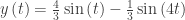
The polar curve 

The graph in the example is


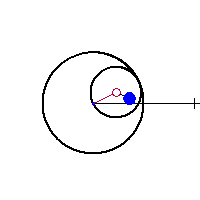
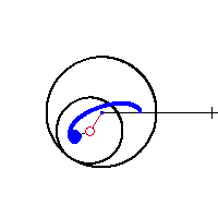
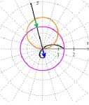
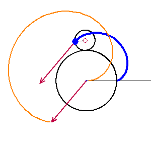
The blue arrow is congruent to the green with its tail at the pole; its point traces the limaçon shown in black. (Click to enlarge.)
-

- Figure 1
-
- Figure 2
-
- Figure 3
-

- Figure 4
- In figure 1, the distance is positive and both arrows point in the same direction along the rotating ray.
- In figure 2, the two circles intersect and the distance between them is zero. The limaçon goes through the origin.
- In figure 3, the curves have changed position and the directed distance is negative. The blue arrow points in the negative direction opposite to the rotating ray drawing the inner loop.
- In figure 4, the arrows return to pointing in the same direction, but are longer due to the fact that the distance runs from the orange circle to the far side of the light blue circle forming the bottom outside loop
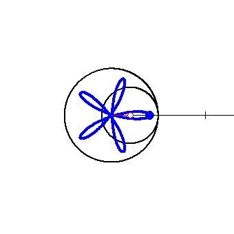
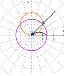
In the clip below the limaçon is drawn as the black ray rotates from 0 to 
On the right side of the clip are the two functions graphed in rectangular form. The blue arrow on the right is the same length as the blue arrow on the left and gives the directed distance from
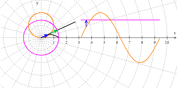
A limaçon being graphed.
This form is probably more familiar to students and may help them see the relationships. The Winplot file may be downloaded here. If you or your students what to investigate further, click on the Winplot graph and then CTRL+SHIFT+N to see the notes; they will also tell you how to change the A, B, and R sliders to change the curves.
 from the first. (From the previous posts: if
  then there are d dips, loops, or cusps in n full revolutions). Both graphs will have the same R value.


 , R = 0.00667 and slightly less than a full revolution. Make the image size (under the file tab) 12.3 x 12.3 (the units are cm.), or 465 x 465 pixels (type @ after the number to use pixels). Amazing!
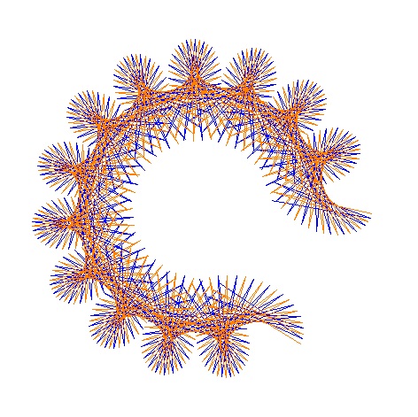


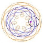

 there will be cusps, if
  dips, and if
  loops. (Of course, you could have your students discover this on their own.) Experiment with this to make other designs.
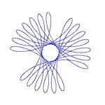


 . At the cusps dy/dx is an indeterminate form of the type 0/0. (Note that at
  ,
,  and likewise for the sine.) Since derivatives are limits, we can apply L’Hôpital’s Rule and find that at


 .
. the same? Justify your answer. (Warning: The graphs certainly look the same. I have not been able to do show they are the same (which certainly doesn’t prove anything), so they may not be the same.) Please post your answer using the “Leave a Reply” box at the end of this post.