Using the Derivative to Graph the Function

In my last post I showed how to use a Desmos graph to discover, by looking at the tangent line as it moved along the graph of the function, the properties of the derivative of a function. This post goes in the opposite direction. Now, instead of discovering the properties of the derivative from the graph of the function, we will use that knowledge to identify important information about the function from the graph of its derivative. We are not discovering anything here; rather we are putting our previous discoveries to use.

One of the uses of the derivative is to deduce properties of its antiderivative, i.e. the function of which it is the derivative. This is an important skill for students to be able to use. It is also a type of question that appears on every Advanced Placement Calculus exam in both the free-response sections and the multiple-choice sections. My previous post on this topic, Reading the Derivative’s Graph, is the most read post on this blog. This post expands on the concepts in that post and shows how to use the Desmos file to help students develop the skills necessary to answer this type of question.

Desmos is free. You and your students can set up their own account and save their own work there. There are also free Desmos apps for tablets and smart phones.

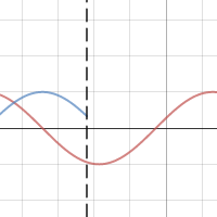
Click on the graph above. Here’s what you should see:

  • The first equation on the left side is f(x). This is the function whose antiderivative we will be trying to create. You may change this to any function you wish.
  • The second equation is F(x) the antiderivative of f(x). That is ‘(x) = f(x). Desmos cannot compute an antiderivative so you will need to enter it yourself. Your students need not trust you on this: have them check your equation by differentiating. Of course, at this point they will not be ready to find the analytic form of the antiderivative except for the simplest functions. This comes later in the year.
  • Note the “+C” is included and later we will manipulate this with a slider.
  • The antiderivative is multiplied by \frac{\sqrt{a-x}}{\sqrt{a-x}}. This is a way of controlling the “a” slider and should always be multiplied by antiderivative. This is just a syntax trick to make the graph work and is not part of the antiderivative. When x is to the left of a, (x < a) the fraction is 1 and the graph will be seen; when x is to the right of a, (x > a) the expression is undefined, and nothing will graph. As you change “a” with the slider the graph of an antiderivative will be drawn.
  • The third equation x = a graphs a dashed vertical to help you line up the corresponding points on the two graphs.
  • The next two lines are the “a” and “C” sliders. Make C = 0 for now and move the “a” slider.

At this point students should know things about the relationship between a function and its first and second derivatives. This includes the things they discovered in the previous post such as when the function is increasing the derivative is non-negative, and when the tangent line is above the graph the slope (derivative) is decreasing and the graph of the function is concave down. All of these concepts are really “if, and only if” situations. So we now consider them in reverse and deduce properties of the antiderivative from the properties of the graph of the derivative.

Using the “a” slider starting at the left side of the graph ask the students what the derivative tells them about the function in this part of the domain. Is the function increasing or decreasing? Is it concave up or down? etc.  Go slowly from left to right asking what happens next, and why (that is, how do you know? What feature of the derivative tells you this?) This is preparing them to write the justifications required on the AP exams.

Certain points on the graph of the derivative are important. The zeros of the derivative and whether the derivative changes from positive to negative, negative to positive, or neither are important. Likewise, the extreme values of the derivative point to important features of the function – points of inflection.

Once you have a complete graph of the antiderivative move the “C” slider.

  • Remind students that the derivative of a constant is zero and therefore, the C does not show up in the derivative.
  • Discuss is why changing the antiderivative does not change the derivative.
  • Ask, how many functions have the same derivative?
  • Point out is that by changing “C” the graph of an antiderivative can be made to go through any (every, all) point in the plane.

Switch to a different function and its derivative to reinforce the concepts. Yo will have to enter both the derivative and the antiderivative.Do this as often as necessary. You could also give students or groups of students the graph of a derivative (on paper) and challenge them to sketch the antiderivative.

A disclaimer: A function and its derivative should not be graphed on the same axes, because the two have different units. Nevertheless, I have done it here, and it is commonly done everywhere, to compare the graphs of a function and its derivative so that the important features of the two can be lined up and easily compared.

.


Variations on a Theme by ETS

Experienced AP calculus teacher use as many released exam questions during the year as they can. They are good questions and using them gets the students used to the AP style and format.  They can be used “as is”, but many are so rich that they can be tweaked to test other concepts and to make the students think wider and deeper.  

Below is a multiple-choice question from the 2008 AB calculus exam, question 9.

 2008 mc9The graph of the piecewise linear function f  is shown in the figure above. If \displaystyle g\left( x \right)=\int_{-2}^{x}{f\left( t \right)\,dt}, which of the following values is the greatest?

(A)  g(-3)         (B)  g(-2)         (C)  g(0)         (D)  g(1)         (E)  g(2)

I am now going to suggest some ways to tweak this question to bring out other ideas. Here are my suggestions. Some could be multiple-choice others simple short constructed response questions. A few of these questions, such as 3 and 4, ask the same thing in different ways.

      1. Require students to show work or justify their answer even on multiple-choice questions. So for this question they should write, “The answer is (D) g(1) since x = 1 is the only place where {g}'\left( x \right)=f\left( x \right) changes from positive to negative.” 
      2. Ask, “Which of the following values is the least?” (Same choices)
      3. Find the five values listed.
      4. Put the five values in order from smallest to largest.
      5. If \displaystyle g\left( x \right)=g\left( -2 \right)+\int_{-2}^{x}{f\left( t \right)dt} and the maximum value of g is 7, what is the minimum value?
      6. If \displaystyle g\left( x \right)=g\left( -2 \right)+\int_{-2}^{x}{f\left( t \right)dt} and the minimum value of g is 7, what is the maximum value?
      7. Pick any number (not just an integers) in the interval [–3, 2] to be a and change the stem to read, “If \displaystyle g\left( x \right)=g\left( a \right)+\int_{a}^{x}{f\left( t \right)dt} ….” And then ask any of the questions above – some answers will be different, some will be the same. Discussing which will not change and why makes a worthwhile discussion.
      8. Change the equation in the stem to \displaystyle g\left( x \right)=3x+\int_{-2}^{x}{f\left( t \right)dt} and ask the questions above. Again most of the answers will change. Also this question and the next start looking like some free-response questions. Compare them with 2011 AB 4 and 2010 AB 5(c)
      9. Change the equation in the stem to \displaystyle g\left( x \right)=-\tfrac{3}{2}x+\int_{-2}^{x}{f\left( t \right)dt} and ask the questions above. This time most of the answers will change.
      10. Change the graph and ask the same questions.

Not all questions offer as many variations as this one. For some about all you can do is use them “as is” or just change the numbers.

Any other adaptations you can think of?

What is your favorite question for tweaking?

 Math in the News Combinatorics and UPS

Revised: August 24, 2014

Interpreting Graphs

AP Type Questions 1

The long name is “Here’s the graph of the derivative, tell me things about the function.”

Most often students are given the graph identified as the derivative of a function. There is no equation given and it is not expected that students will write the equation (although this may be possible); rather, students are expected to determine important features of the function directly from the graph of the derivative. They may be asked for the location of extreme values, intervals where the function is increasing or decreasing, concavity, etc. They may be asked for function values at points.

The graph may be given in context and student will be asked about that context. The graph may be identified as the velocity of a moving object and questions will be asked about the motion and position. (Motion problems will be discussed as a separate type in a later post.)

Less often the function’s graph may be given and students will be asked about its derivatives.

What students should be able to do:

  • Read information about the function from the graph of the derivative. This may be approached as a derivative techniques or antiderivative techniques.
  • Find where the function is increasing or decreasing.
  • Find and justify extreme values (1st  and 2nd derivative tests, Closed interval test, aka.  Candidates’ test).
  • Find and justify points of inflection.
  • Find slopes (second derivatives, acceleration) from the graph.
  • Write an equation of a tangent line.
  • Evaluate Riemann sums from geometry of the graph only.
  • FTC: Evaluate integral from the area of regions on the graph.
  • FTC: The function, g(x), maybe defined by an integral where the given graph is the graph of  the integrand, f(t), so students should know that if,  \displaystyle g\left( x \right)=g\left( a \right)+\int_{a}^{t}{f\left( t \right)dt} then  {g}'\left( x \right)=f\left( x \right)  and  {{g}'}'\left( x \right)={f}'\left( x \right).

The ideas and concepts that can be tested with this type question are numerous. The type appears on the multiple-choice exams as well as the free-response. They have accounted for almost 25% of the points available on recent test. It is very important that students are familiar with all of the ins and outs of this situation.

As with other questions, the topics tested come from the entire year’s work, not just a single unit. In my opinion many textbooks do not do a good job with these topics.

Study past exams; look them over and see the different things that can be asked.

For some previous posts on this subject see October 151719, 24, 26, 2012 January 25, 28, 2013

Inrtoducing Power Series 2

In our last post we found that we could produce better and better polynomial approximations to a function. That is, we produced a set of polynomials of increasing degree that had the same value for the functions and its derivatives at a given point. To see what is going on I suggest we graph these approximating polynomials along with the given function.

We found that the polynomials \left( x-1 \right), \left( x-1 \right)+\left( -\tfrac{1}{2} \right){{\left( x-1 \right)}^{2}}, \left( x-1 \right)+\left( -\tfrac{1}{2} \right){{\left( x-1 \right)}^{2}}+\left( \tfrac{1}{6} \right){{\left( x-1 \right)}^{3}}, and \left( x-1 \right)+\left( -\tfrac{1}{2} \right){{\left( x-1 \right)}^{2}}+\left( \tfrac{1}{6} \right){{\left( x-1 \right)}^{3}}+\left( -\tfrac{1}{4!} \right){{\left( x-1 \right)}^{4}} produced approximations to the natural logarithm function at the point (1, 0). To see how this works, graph each of these polynomials, one after the other. See the figure below.

This slideshow requires JavaScript.

Notice that each polynomial comes closer to the graph of the graph of y = ln(x), the black graph, in the figures.

You students can do this on their graphing calculators or with a graphing program. More on how to do  this below.

Now do the same thing with the polynomials found for the sine function.

This slideshow requires JavaScript.

However, there is a difference. The sine polynomials seem to hug the sine graph over increasingly wider intervals while the logarithm polynomials do not. This may not be a surprise since the logarithm function has no values for x\le 0 while the polynomials do. The polynomials cannot come close to the graph if there is no graph.

Students should notice these things:

  • Successively higher degree polynomials seem to come closer to the graph of the function than the previous one.
  • The polynomials may exist outside the domain of the function (outside of x>0 for ln(x) for example).
  • The interval where the graphs are near the function is limited.

Taken together these two examples suggest several questions (which you can perhaps draw out of your class):

  1. If there were an infinite number of terms would the Polynomial be the same as the function?
  2. How do you add an infinite number of terms?
  3. Over what interval is the approximation “good”? Is the interval the same for all functions? How do you find the interval?
  4. How good is the approximation?
  5. Is there an easier way to build the polynomial? Do you have to figure out and evaluate all of the derivatives?

These questions will be the topic of my next post.

________________________________________

How to Graph these Polynomials using Winplot

You can enter each polynomial separately of course, but here is an easier way.

  1. After setting your viewing window (CTRL+V), push [F1] to get the explicit equation entry window and enter sin(x) (or the function you are interested in) and click [OK] to graph y = sin(x).
  2. Then push [F1] again and enter Sum( (-1)^(n+1)x^(2n-1)/(2n-1)! ,n,1,A) and click [OK]. The underlined part may be changed to the general term of any series.  The n identifies the variable, the 1 is the starting value of n and the A will be the final value which we will change.
  3. Next click on [ANIM] > [Individual] > [A]. This will bring up a slider. Enter 100 in the box and click [Set R] and then enter 0 and click [Set L]. This will make the A values change by exactly 1 allowing you to look at A = 1, 2, 3, 4, … in order.
  4. Click the tab on the “A” slider window box and see the various approximating polynomials “hug” the graph


Graphing with Accumulation 2

Accumulation 4: Graphing Ideas in Accumulation – Concavity

In the last post we saw how thinking about Riemann sum rectangles, RΣR, moving across the graph of the derivative made it easy to see when the function whose derivative was given increased and decreased and had its local extreme values. Today we will consider concavity.

Suppose a derivative is constant, its graph a horizontal line. In this case each successive RΣR is exactly the same size and adds exactly the same amount to the accumulated function. The function’s graph increases (or decreases) by exactly the same amount – it is linear.

For derivatives that are not constant, the change in the resulting function is not constant and the function’s graph bends up or down. This bending of the function is referred to as its concavity. If it bends up, the function increases faster and its graph is concave up; if it bends down, it is increasing slower (or decreasing faster) and concave down.

RSR 2

The graph above shows pairs of RΣR in different intervals as they move along the graph of a derivative. Consider the dark blue rectangle to be the previous position of the red rectangle.

As the RΣR moves from a to b each red rectangle is larger than the dark blue one. Each move adds more to the accumulated sum than the previous one. The graph of the function increases more with each move – it is concave up.

As the RΣR moves from b to d (there are two pairs drawn) each red RΣR has a smaller value than the previous one. (Remember when they are below the x-axis the longer (red) RΣR has a smaller value.) In the interval [b, d] less is added to the accumulated sum (or more is subtracted) with each move to the right. Therefore, the graph of the function bends down – the function is concave down.

In the last section, from d to f the red rectangle now has a larger value than the dark blue one. (Again, remember that when the function has negative values, the shorter rectangle, has the larger value.) The graph of the function again bends up – is concave up.

Putting these ideas together with those in the last post we can see how the moving RΣR idea can distinguish the four shapes of the graph of the accumulating function:

  • On [a, b] the function’s graph is increasing and concave up; the RΣR are positive and getting more positive (longer).
  • On [b, c] the function’s graph is increasing and concave down; the RΣR are positive and getting less positive (shorter).
  • On [c, d] the function’s graph is decreasing and concave down; the RΣR are negative and getting more negative (longer).
  • On [d, e] the function’s graph is decreasing and concave up; the RΣR are negative and getting less negative (shorter).
  • At the extreme values of the derivative, the concavity of the function changes from up to down or down to up. These are called points of inflection.

Questions in which students are asked about the properties of a function given the graph, but not the equation, of the derivative are very common. Many students (including me) find this approach easier and more intuitive than working strictly with derivative ideas.

Graphing with Accumulation 1

Accumulation 3: Graphing Ideas in Accumulation – Increasing and decreasing

Previously, we discussed how to determine features of the graph of a function from the graph of its derivative. This required knowing (memorizing) and understanding facts about the derivative (such as the derivative is negative) and how they related to the graph of the function (the function was decreasing). There is another method that I prefer. I find that using the accumulation idea it is easy to “see” what the function is doing.

Consider the graph of the derivative of a function and picture one Riemann sum rectangle (RΣR) as it moves from left to right across the graph. If the derivative is positive the RΣR will have a positive value and if the derivative is negative the RΣR will have a negative value. Each RΣR adds to or subtracts from the accumulated value that is represented by the function.

RSR 1

In the drawing above we see the graph of a derivative with a RΣR drawn at three places. At a the function has some initial value which may be 0. As the RΣR moves from a to c the RΣR have a positive value and each one adds a little to the function’s value. The function accumulates value and increases.

As the RΣR moves from c to e the value of the RΣR is negative and thus subtracts from the accumulating value, so the function decreases.

In the interval e to g the RΣR once again is positive so the accumulating value increases.

At c the RΣR changes from a positive value to a negative value, the function changes from increasing to decreasing: a local maximum. A similar thing happens at e, the RΣR changes from negative to positive, the function changes from decreasing to increasing: a local minimum.

To see and determine where the function is increasing and decreasing from the graph of its derivative, just picture the RΣR sliding left to right across the graph, each one adding to or subtracting from the accumulated value which is the function.

Often there are AP Calculus exam questions that show a derivative made up of segments or parts of circles. It is possible to find the area of the regions between the derivative and the x-axis. Starting on the extreme left side add or subtract the areas of the region to find the exact function values. If the left side value is not given (that is, some other place is the initial condition), treat the left-end value as a variable and add or subtract until you get to the initial value, and solve for the variable.

Next: Accumulation and concavity

Jobs, Jobs, Jobs

Here is a problem similar to those in the last two posts; this one is based on a graph. The numbers are a little hard to read (sorry), but perhaps we do not need them. (If you want to do the numbers it is the second graph from the source which is more readable. There are other graphs of this type in the source, if you want some more.)

The discussion is aimed at relating the graph which is a derivative with the net change it describes. Thus, we are looking at determining increasing, decreasing, and relative extreme value from the graph and foreshadowing how this can be done using integration concepts especially accumulation.

Source: The Bureau of Labor Statistics

Some questions to discuss.

    1. What are the units of this data, and what kind of units are they? (Thousands of jobs per month – a rate unit.)
    2. Ask the students how they would find the total change in employment over the period given and discuss this with them. (Do not make them do the computation, just discuss how.)
    3. Ask them to indicate on the graph when the total employment was the least and explain how they can tell from the graph (January 2010 – this is where the rate changes from negative to positive; this is the graph of a rate in thousands of jobs per month, therefore it is the derivative of jobs (employment)).
    4. Ask how they could verify this by computing. What would they compute month-by-month? (The total number of jobs lost or gained from the beginning of the period – the accumulated change in jobs.)
    5. During 2010 there is a local maximum in employment and another (local) minimum: when do they occur? How do you know without doing a computation?
    6. What additional information do you need to tell how many people actually had jobs at any time during this period? (The total number employed at the beginning of 2008 – the initial condition.)