
A few days ago, Paul Krugman wrote a blog about the job situation in the US. Evan J. Romer, a mathematics teacher from Conklin, NY, used it as the basis for a great exercise on reading the graph of the derivative, the subject of my last post. He posted the questions to the AP Calculus Learning Community. I liked them so much I have included them on my blog with Evan’s kind permission. The questions and solutions are here and on the Resources Tab above.
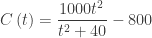
He used the graph below which shows the change in the number of non-farm jobs per month; in other words, the graph of a derivative of the number of people employed. The jagged graph is the data; the smooth graph is a model approximating the data.

The model is
From this Mr. Romer developed a series of questions very similar to AP questions. Don’t overlook the last note which discusses a “classic AP calculus mistake” made by the first person to reply to Krugman’s blog.
The first of Romer’s questions are integration questions, which you may not yet have gotten to with your class. Below is another graph of nearly the same data displayed as a bar graph. (Around February 2010 this was dubbed the “Bikini Graph” – if you look at the graph before that date you will see why.) It may be helpful in explaining the first of Romer’s questions to your class since each bar represents the change in the number of jobs for that month and leads into the concept of accumulation and the integral as the area between the graph and the axis. You can return to this when you introduce integration.

Thank You Evan.
