
Why “scaling” is necessary
No teacher can make two tests on the same topics equal in difficulty. No two teachers, even if they collaborate, can make two tests on the same topic equal in difficulty. No two teachers in different schools, districts, or states can make two tests on the same subject equal in difficulty. Even professional testing companies, such as the Educational Testing Service (ETS) that writes the AP exams, cannot write two tests on the same courses of equal difficulty.
Scaling is needed to account for the difference in difficulty. Scaling attempts to make the scores on different forms of a test indicate that a student writing the test has the same amount of knowledge as another student with a similar score.
The ETS does this by pre-testing its items on college students and including several questions from previous years to help judge the difficulty from year to year. They do a great deal of statistics on each item each year. But they do not pretend that this year’s test is the same difficulty as last year’s test. After their computations and consultations with colleges are done, they scale the test. Their goal is to make the score indicate the same amount of knowledge from test to test and year to year.
A teacher cannot do that in his or her class. They don’t have the resources or the time. Yet, there are ways to even out the difficulty of your classroom tests and quizzes. .
Some poor ways to scale
In what follows, P will represent the percentage of the total points available on a test that a student earns, and S will equal the score the student is given for that percentage.
Percentage scaling (S = P): For many years I, and I expect most teachers, simply let S = P. But sometimes the scores were kind of low: the test was too hard, or the students didn’t do well (or maybe the teacher didn’t do well). What to do? Among the usual solutions are (1) give a make-up test, (2) let the students make corrections to earn back some of the points, (3) scale the test by raising all the grades arbitrarily, or (4) make sure the next test is “easy.” I’ve tried all of them.
Doesn’t make too much sense, does it?
Categories: For quite a few years, I listed the percentages from highest to lowest and looked for natural breaks to separate the scores into 90, 80, 70, etc. Intermediate scores were spread between the cut points. If you don’t need a number to put on the report cards, the categories become A, B, C, etc. with perhaps a “+” or a “–“ attached.
Comic Interlude – the “Square Root Scale”
The “square root scale” is 
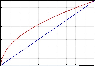
The Square Root Curve,
Compared to the percentage grade, the low scores get raised more than the higher scores. Everyone wins big time, but what does it tell you? I can see no justification for this, except maybe the “complicated” algebra involved fools the students, administrators, and parents into thinking that something really scientific is going on. It’s not.
(Since this is a calculus blog, there is a calculus exercise in the appendix below that analyzes this scheme.)
A Better Choice for Scaling – the Kennedy Scale
While no method is perfect, this method suggested in Assessing True Academic Success by Dan Kennedy [1] is a reasonable and easy one. The entire article is worth reading every year and discusses a lot about assessment, besides just scaling.
He writes of his method, “Mathematically, the effect of scaling is to adjust the mean, a primary goal, and reduce the standard deviation, a secondary effect that helps me keep the entire class engaged.” “[Teachers] can challenge [their] students to do just about anything, then see how far they can go. …[Students] are freed from the burden of getting a certain percent right, so they can concentrate on doing as much as they can as well as they can.”
I used this method for BC Calculus and 8th grade Algebra 1 in the year I came out of retirement and was happy with the results.
Here’s how the method works. First, determine the class mean you desire. Kennedy suggests a class average of 82 for regular classes, 85 for electives, and 90 for advanced. These are based on his school wide empirical (historical) data. You may use your own data or just what you think is reasonable.
Using two data points (class mean, desired mean) and (highest score, 99). (The 99 could be adjusted as you see fit.} Write the equation of the line through these points (P, S) expressing S as a function of P. Use this function to scale the test.
This TI-8x program, from the same article, will easily compute the scores for you. (There is a typo in the fourth line; it should read 0->Ymin:126->Ymax.)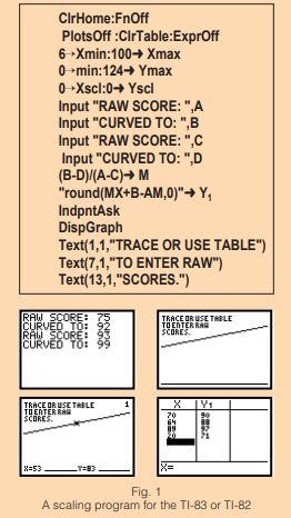
Update Excel Spread Sheet for Kennedy Scale.
At the suggestion of a reader, here is an Excel spreadsheet for you may download for the Kennedy Curve. Enter the four values at the top left and the scores w ill be calculated.
Updated December 8, 2020
Update Desmos Program for Kennedy Score
Dan Anderson sent a comment (see below) with a link to a Desmos graph he made that will calculate the Kennedy scale for your tests. You can access the graph here. Once you’ve opened it, save it to your Desmos files.
It works like this: enter the 4 numbers in the left column AverageRawScore, DesiredAverage, MaxRawScore, and DesiredMax as they apply to your test. The scaled scores will appear in the table in the lower left.
To scale your exam, delete everything in the x1 column and enter your scores (in any order, with duplicates). The scaled scores appear in the second column of the table and the pairs are graphed.
The two highlighted points are (AverageRawScore, DesiredAverage) and (MaxRawScore, DesiredMax). These may be dragged to see the effect of changing them.
A final caution: If the AverageRawScore is greater then or equal to the DesiredAverage (or even close), then some scores may be scaled down. You probably want to avoid this (although, it is consistent with the idea).
Updated October 13, 2018
Update October 19, 2020
Remember, by scaling, you are not giving away free points; you are trying to account for the difference in difficulty from one test to the next.
Scaling Different Versions of the Same Test How to adapt the Kennedy method when using different versions of the same test in your class.
Update August 24, 2021
Appendix: An analysis of the Square Root Curve – A Calculus Exercise
For the function
- Determine the percentage score(s), P, which receives the least points using this method. Justify your answer.
- Determine the percentage score(s), P, which receives the most points using this method. Justify your answer.
- At the value found in 2, what is the slope of the line tangent to the graph of
- Compare your answer for 3 to the slope of S = P. Why must this be so? Is it related to the MVT?
Solution
- Since the Square Root curve lies above the percentage curve all the values receive some increase except the end points (P = 0 and P = 100) which receive no increase.
- Let I = the increase in the score, then


This is the maximum since it is the only place where P’ changes from positive to negative. At P = 25 the score is raised by 25 points to a 50.
3. 
4. At P = 25 the slope of the tangent line to the square root scale is 1: the tangent is parallel to the percentage graph. The square root scale to the left of P =25 is raising faster then S = P therefore its slope is greater. After P = 25 the slope of the square root scale decreases and drops faster than the slope of S = P. P = 25 is the place where the slope changes from steeper to less steep and thus where the slopes are equal. This is the farthest point vertically above the percentage graph. This is also the point guaranteed by the MVT on the interval [0, 100].
[1] Assessing True Academic Success by Dan Kennedy, The Mathematics Teacher, September 1999, page 462 – 466).

Pingback: Back to School 2025 | Teaching Calculus
The Kennedy Scale — and this informative post on same — is a godsend. I had to step in to finish out the last month of a course for a colleague who fell ill (but who has since been recovering, thankfully). With the linked Excel spreadsheet, I was able to attenuate the differences in our grading to produce what seems to me to be the fairest grades possible. Thank you so much!
LikeLike
Thank you. I glad to hear the idea helped.
LikeLike
Thanks for the post
LikeLike
Pingback: Let ‘um Try! | Teaching Calculus
Pingback: What I Learned as a Newbie AP Calculus Teacher | I Speak Math
Does anyone know how to do this in excel?
LikeLike
Dana. Thanks for the suggestion. I have added an Excel spreadsheet that will calculate the scores using the Kennedy Scale. It is after the TI-8x program.
LikeLike
Rigged this up in desmos… enjoy!
https://www.desmos.com/calculator/rz86o11mek
LikeLike
Cool! Thanks.
To use this Desmos graph adjust the 4 numbers above the table and you’re all set. Your scores will appear on the graph and in the right column of the table.
To study the effect of the 4 inputs work, change them or drag the two highlighted points on the graph.
LikeLike